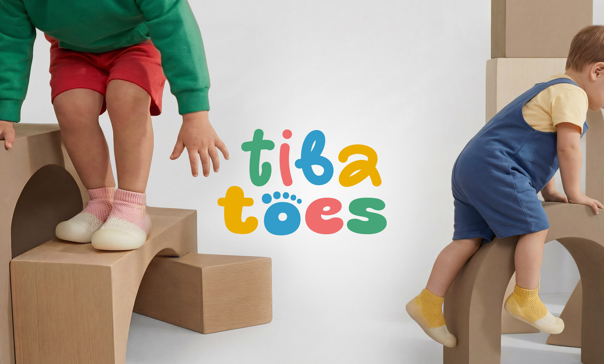
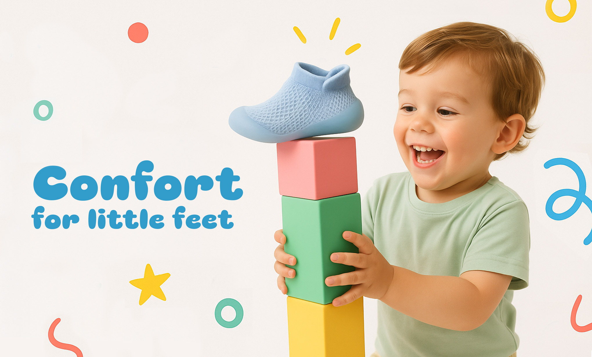
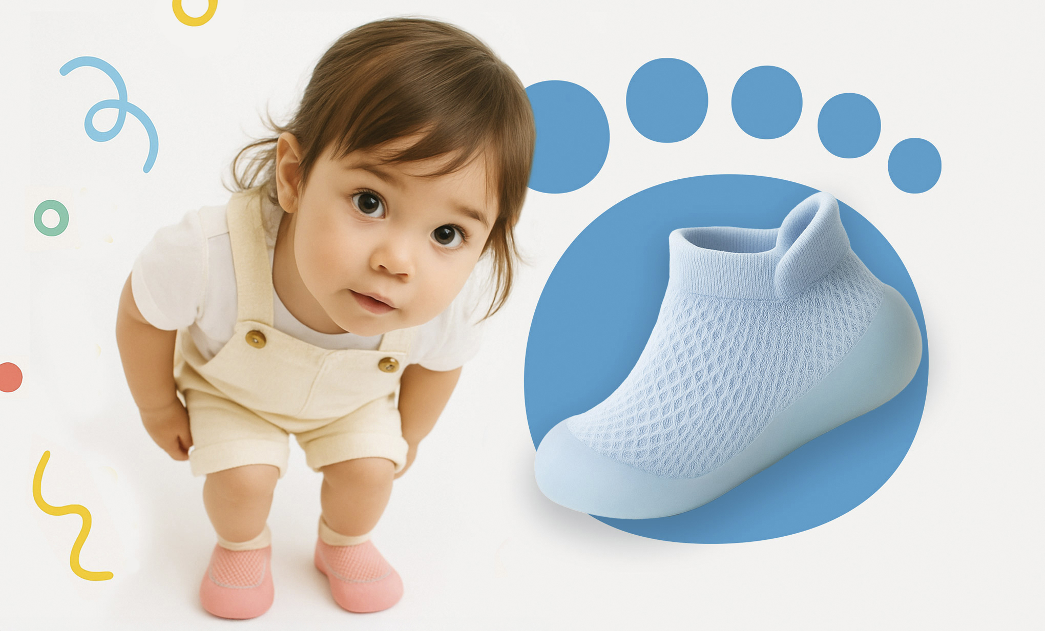
Tibatoes makes sock shoes designed to support natural foot development in young children, allowing them to move freely and safely as if barefoot. The product sits at the intersection of child development science and everyday play, a brand that needed to speak clearly to parents while genuinely delighting kids.
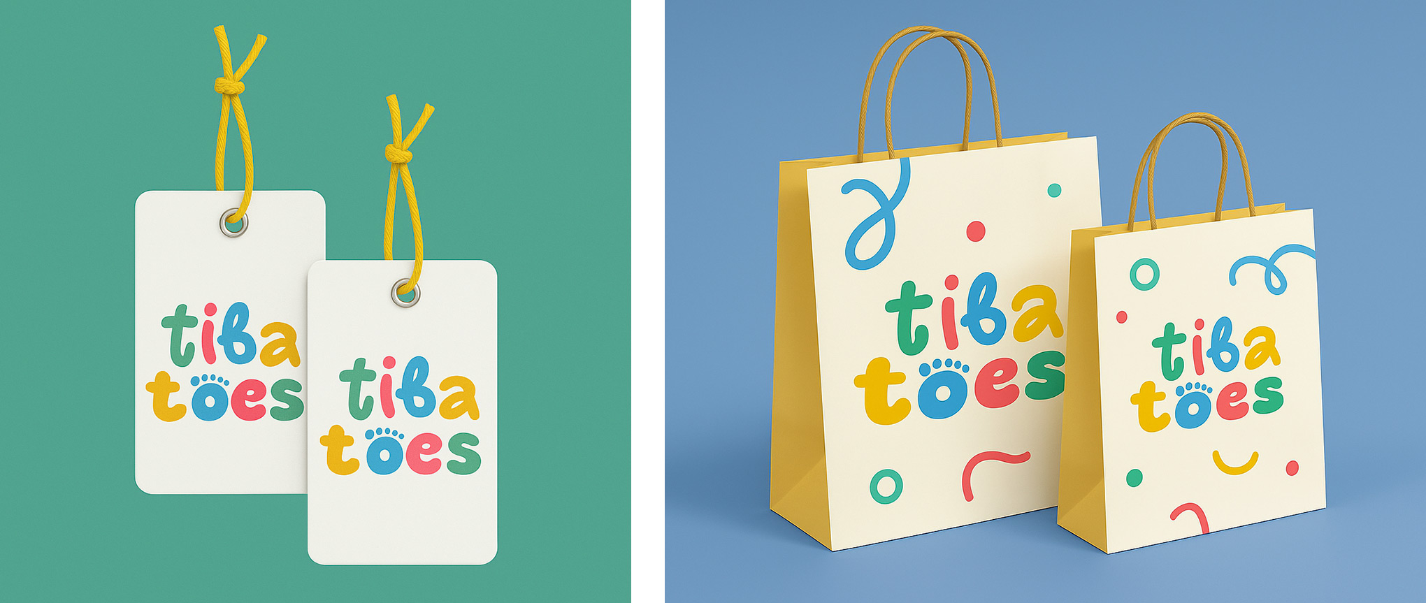
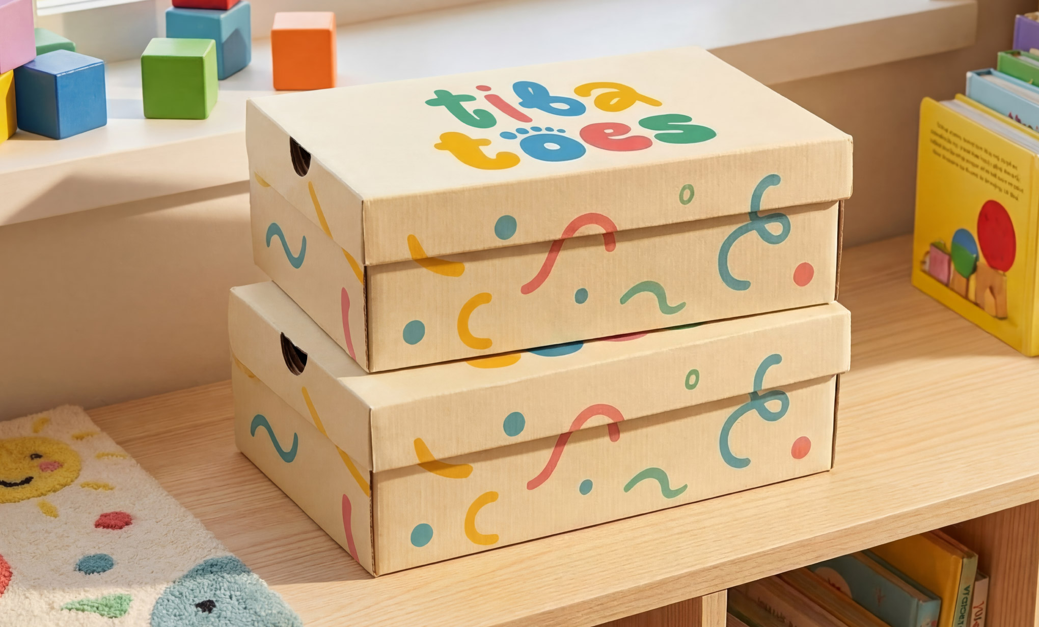
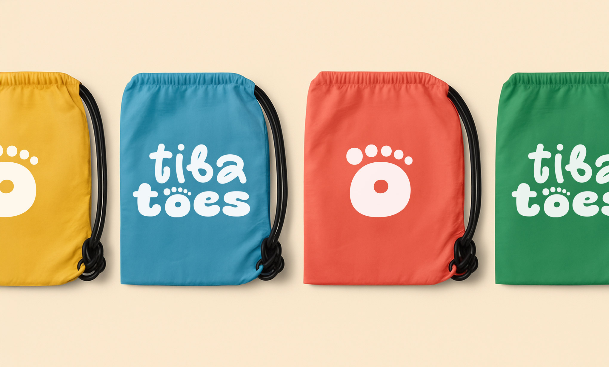
The answer was to let the product’s own philosophy drive my design decision. If the shoe exists to set feet free, the identity should feel unconstrained. The wordmark is set in rounded letterforms where each character is intentionally different, varying in weight, thickness, and color. Some letters are thin, others bold; some compact, others expansive.
This wasn’t inconsistency for its own sake: it reflects the idea that feet are different, that children shouldn’t be forced into a single rigid shape, that freedom means room to be whatever you are. The “o” in “toes” is replaced by a footprint mark, a direct reference to bare feet, grounding the brand’s central idea in the typography itself.
The result is an identity that communicates the same permission the product does: move freely, play, grow naturally, don’t hold back.
INFO:
Client: TibaToes Year: 2024 My Role: Logo Concept, Logo Design