Balans is a pilates studio for a younger, health-conscious audience, people who approach fitness as a practice, not just a routine. The brand needed to feel precise and purposeful, speaking to both the discipline and the physicality of pilates without defaulting to the generic wellness aesthetic.
The insight that shaped everything: in pilates, the body is the instrument. Posture, alignment, and controlled movement aren’t just techniques, they’re the entire point. The identity needed to embody that logic visually, not just reference it.
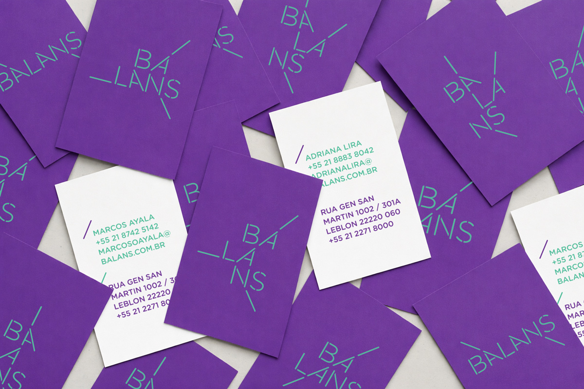
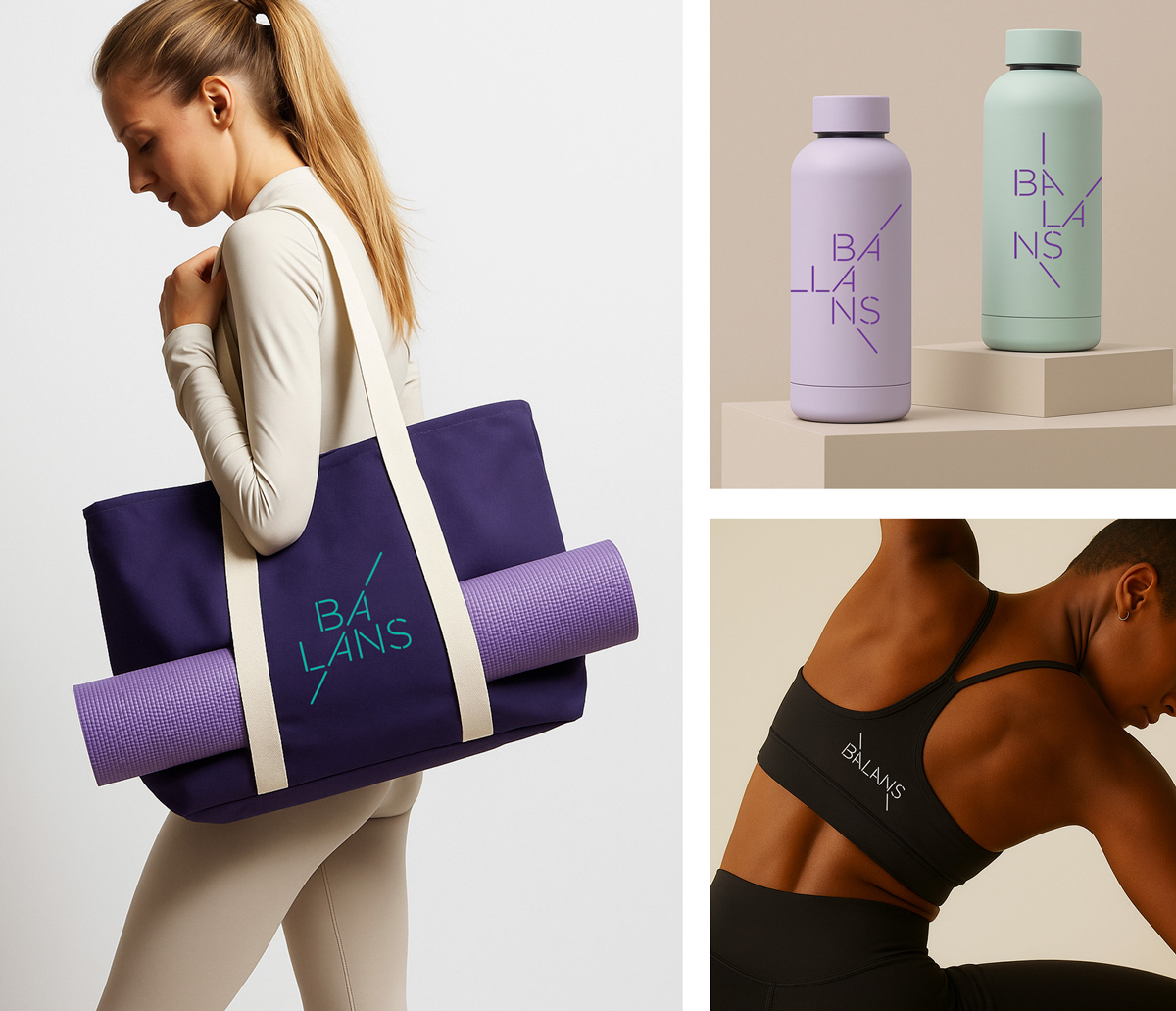
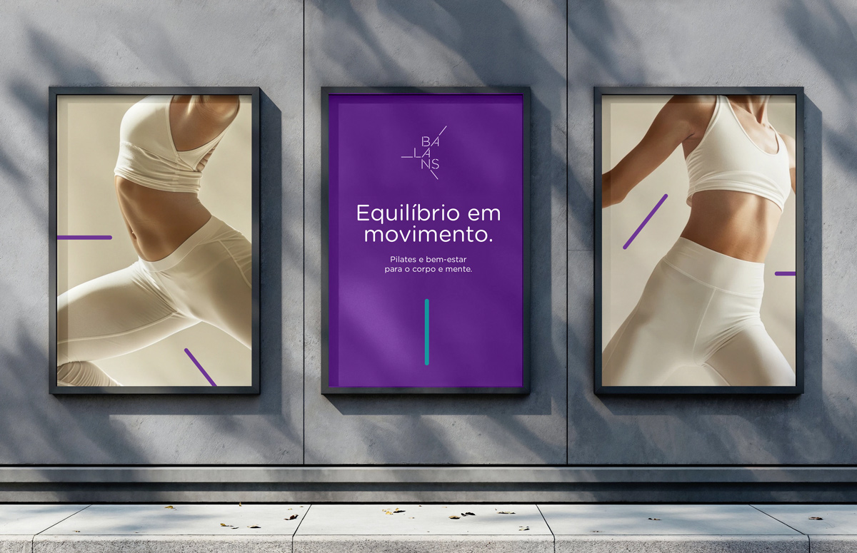
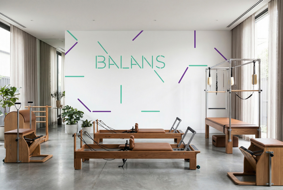
The wordmark is built with custom lettering featuring deliberate linear extensions, strokes that overshoot and angle outward with geometric intention, suggesting tension held in balance. But the system goes further. Rather than a single fixed logo, the identity expands into six distinct compositions, each one restructuring the letterforms of “BALANS” to mirror a specific pilates position. The word itself changes shape with the body.
This wasn’t only a stylistic gesture. It was a structural decision that gave the brand genuine depth, a system that could respond to different contexts while maintaining a coherent visual logic throughout. The teal and purple palette reinforces the studio’s positioning: clean, contemporary, and energetic.
This work was recognized by the Brand New Awards in the Comprehensive Identity Programs category.
INFO:
Client: Balans Company: Tuut Year: 2011 My Role: Logo Concept, Logo Design, Stationery Recognition: Brand New Awards 2011 – Comprehensive Identity Programs