Honolu Poke is a Hawaiian-inspired restaurant built around fresh, made-to-order poké bowls, a brand that needed to feel vibrant, approachable, and distinctly its own in a crowded fast-casual market.
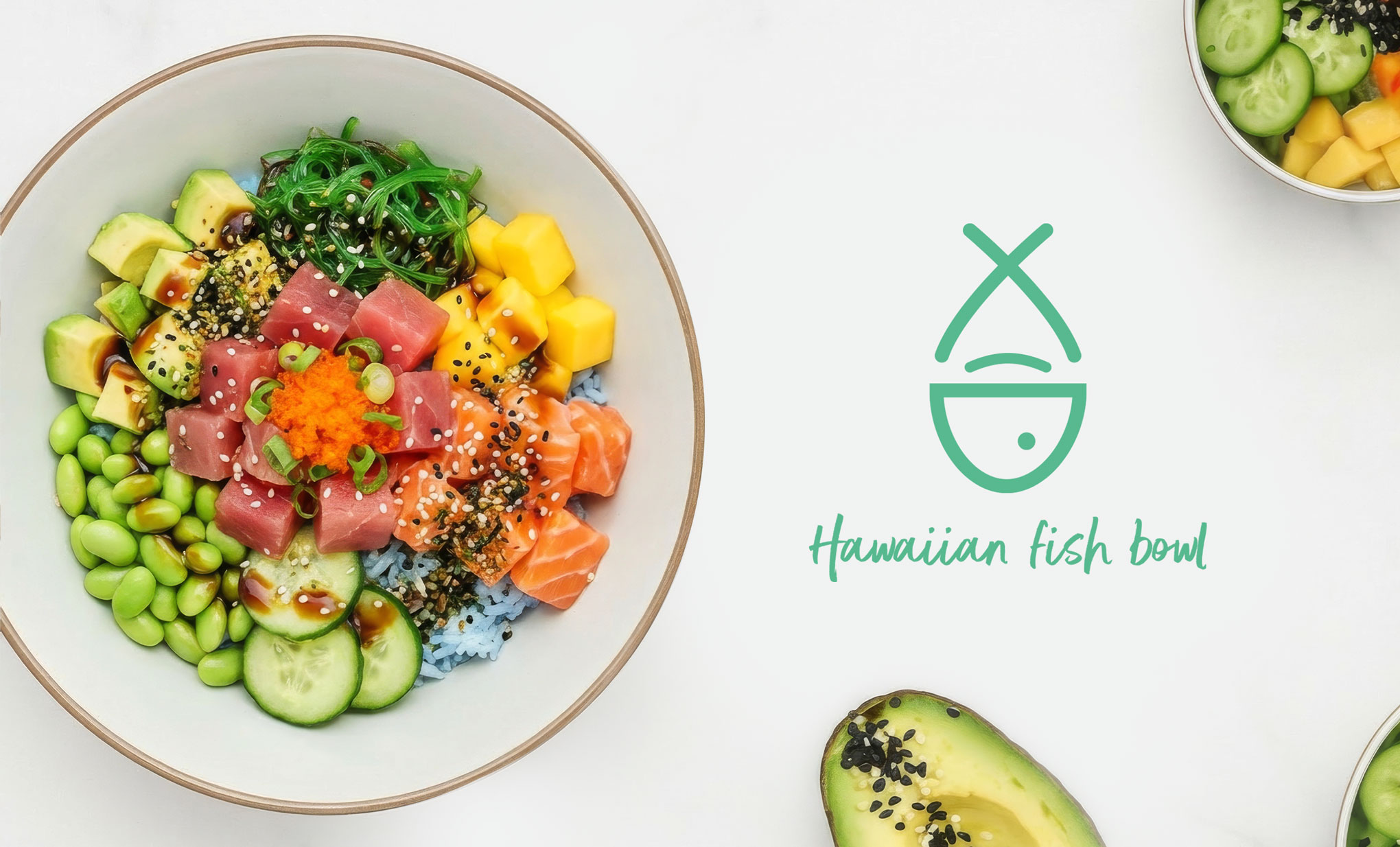
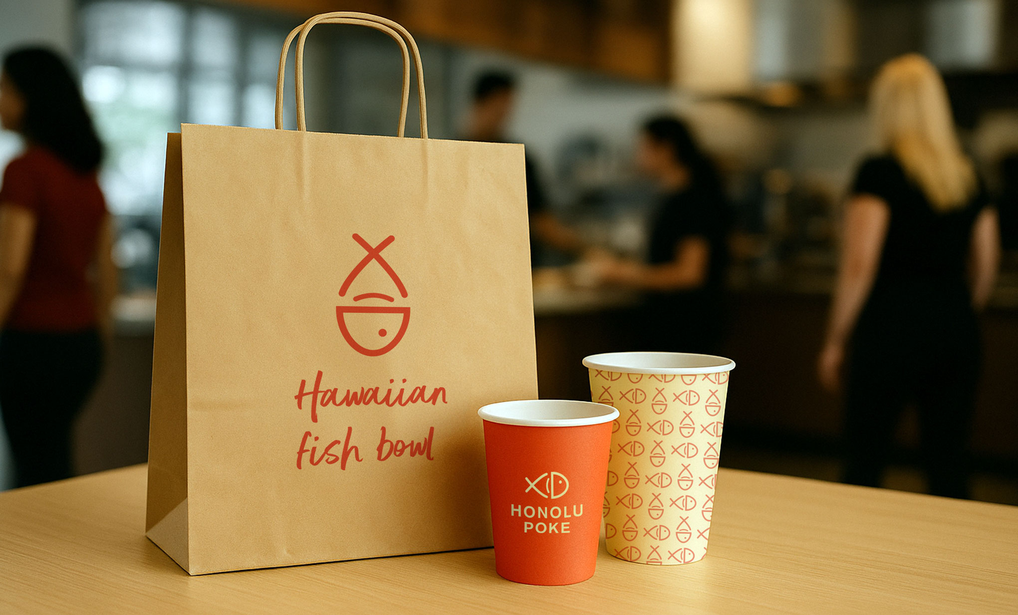
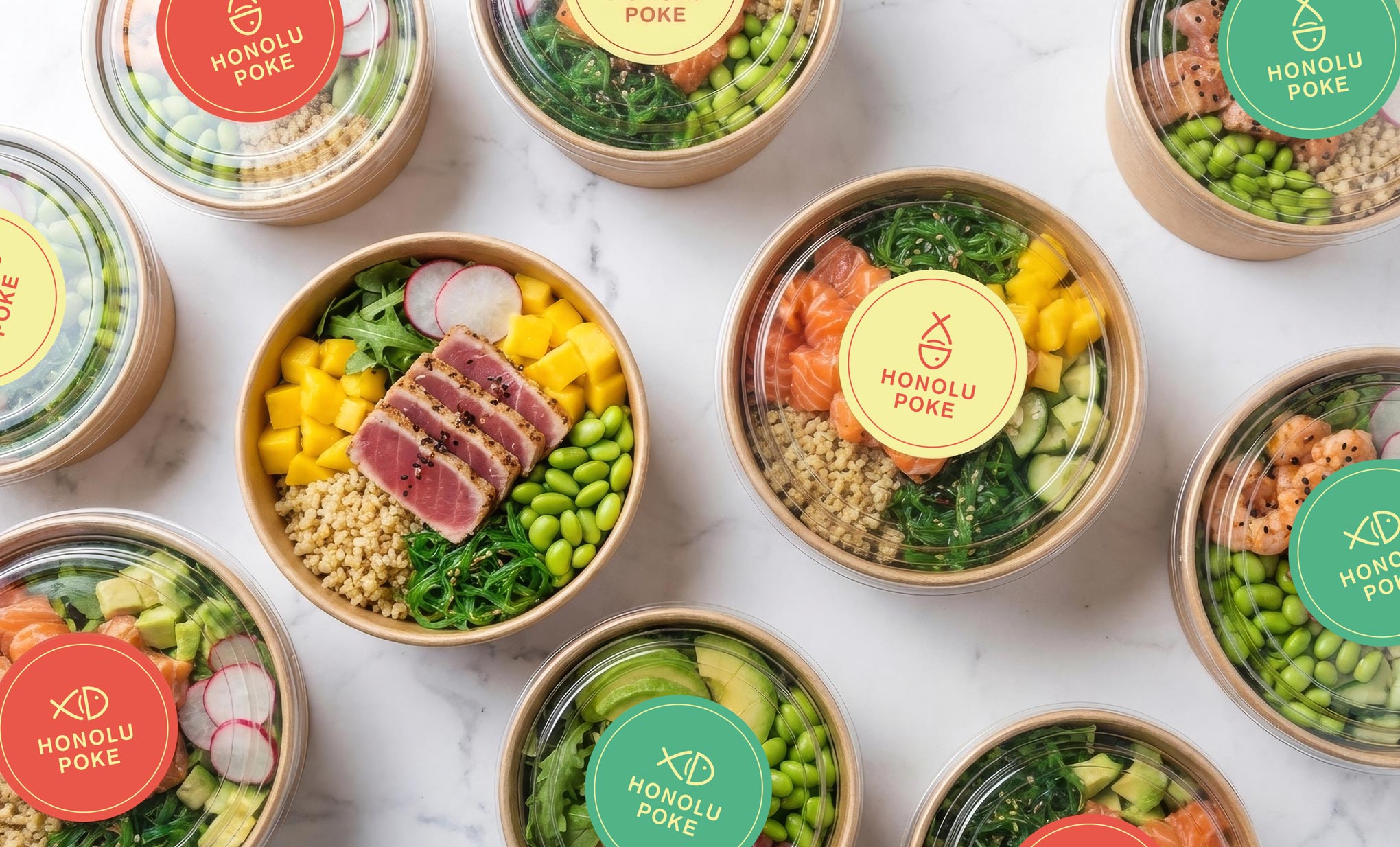
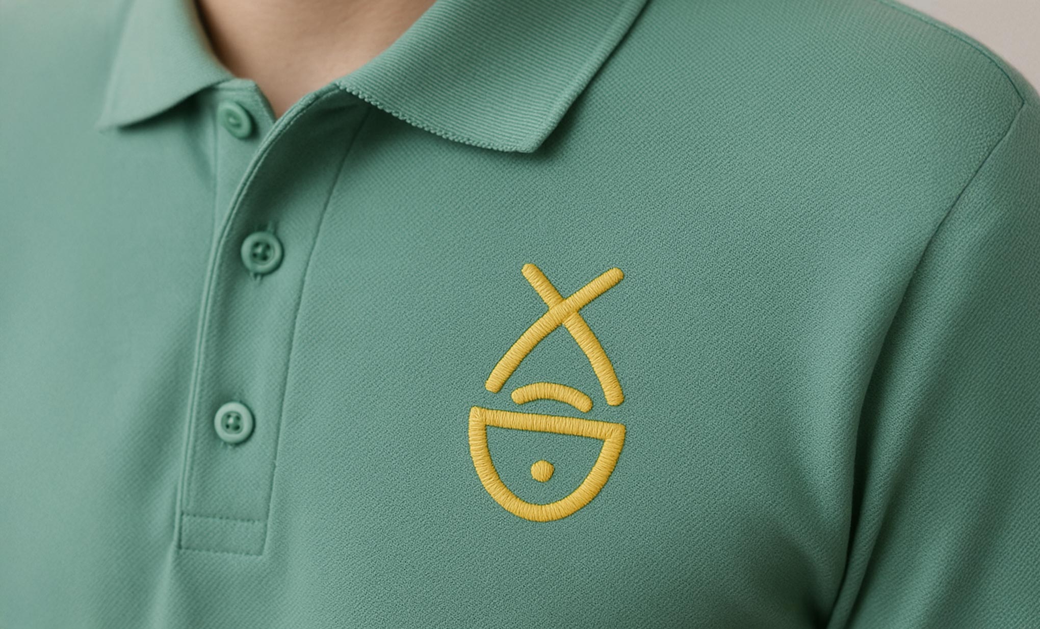
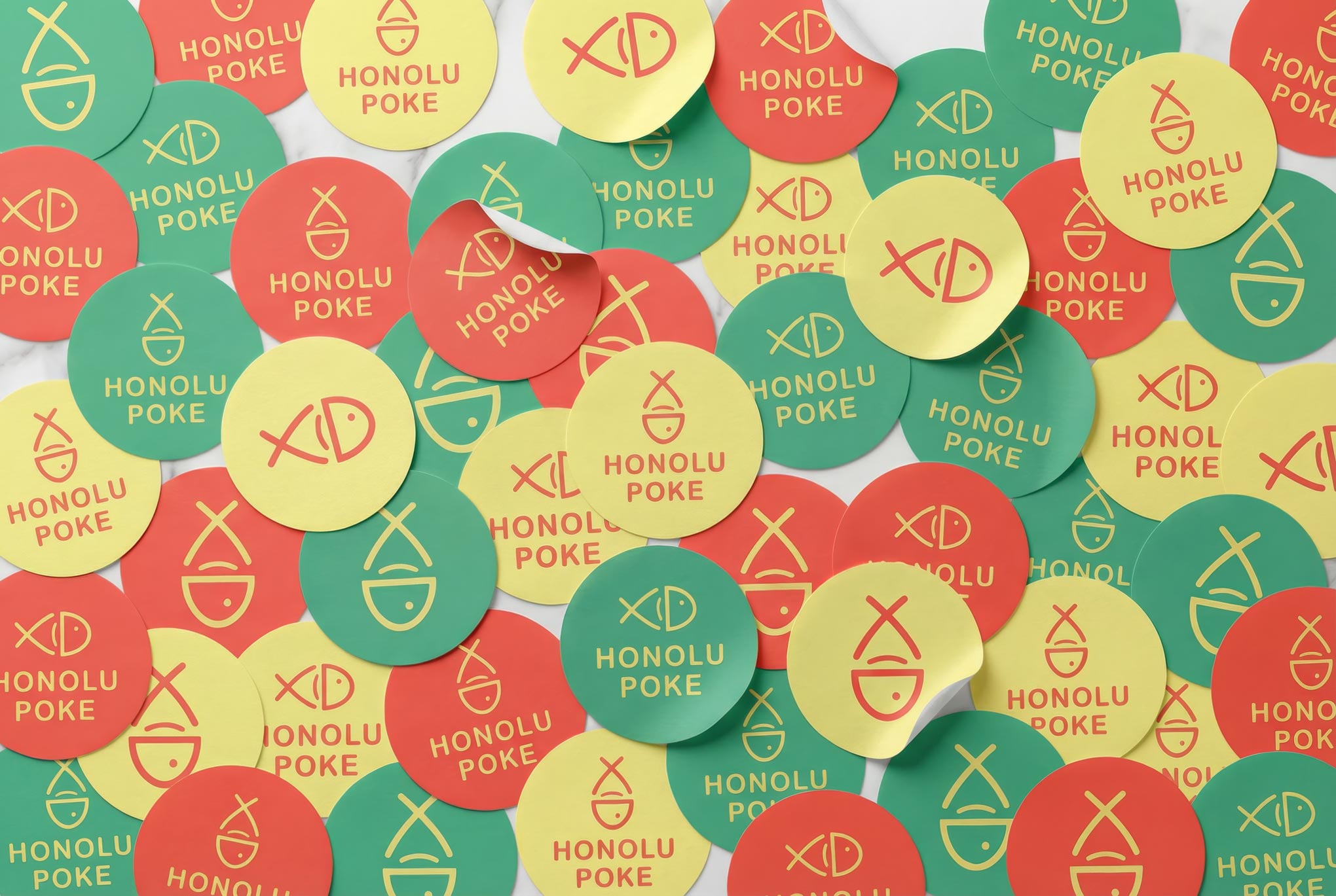
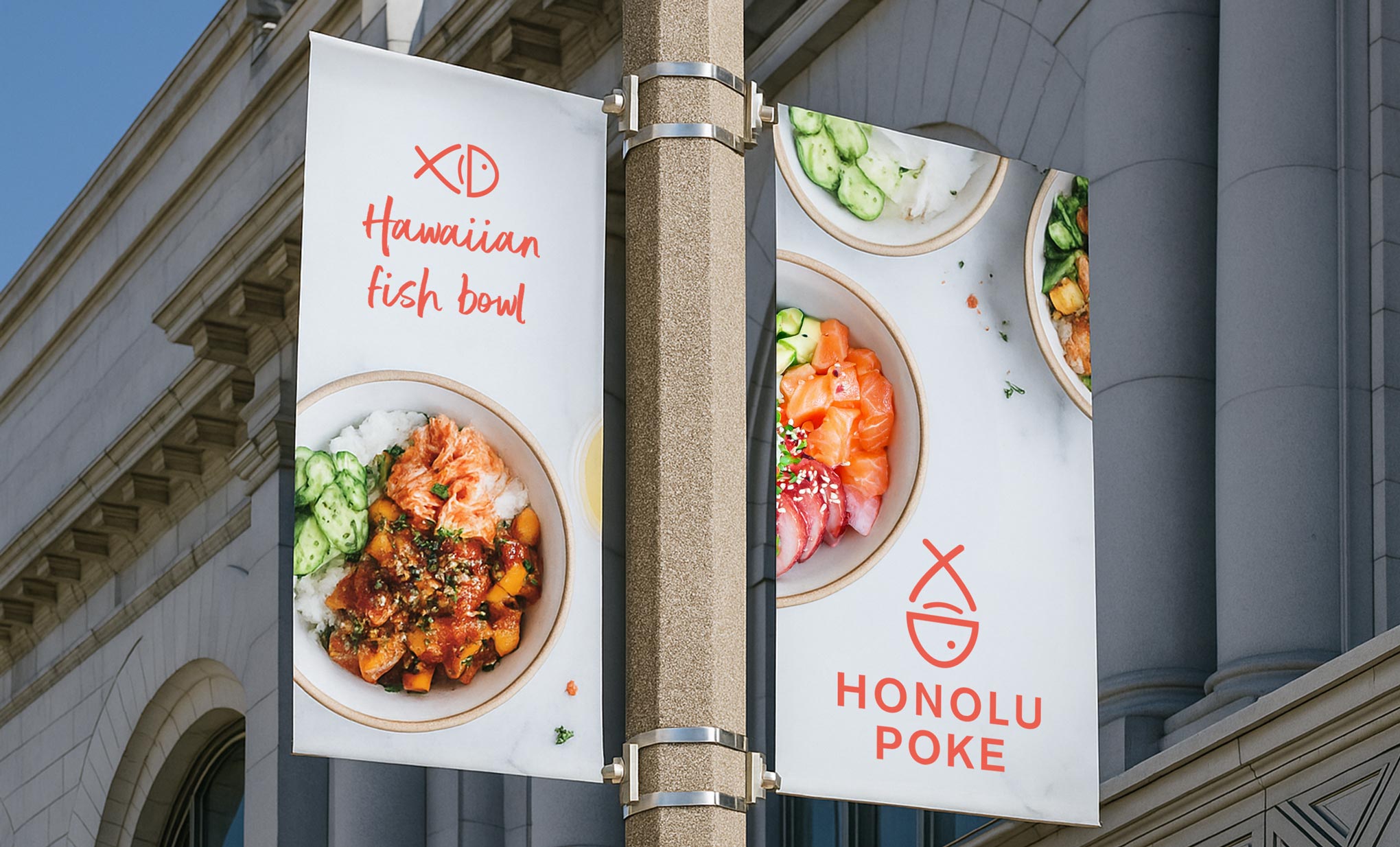
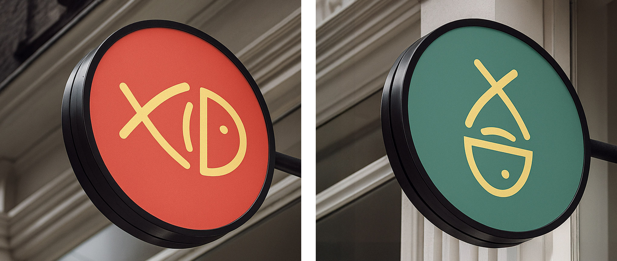
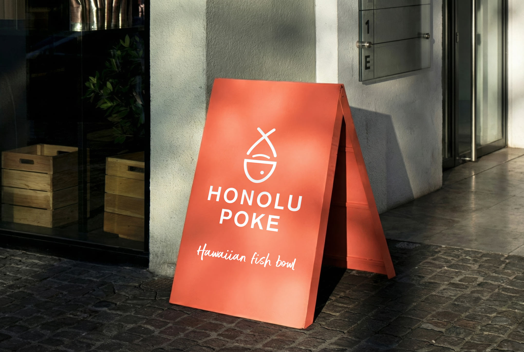
The logo was designed to merge two key elements of the brand: the fish, representing its core ingredient, and the bowl with chopsticks, symbolizing its takeout nature. This dual-purpose icon works both horizontally and vertically, enhancing brand versatility.
The warm, tropical color palette takes its cue from the Hawaiian flag, with greens, reds, and yellows reinterpreted into tones that feel fresh and appetite-driven. It communicates the laid-back essence of Hawaiian culture, while playful patterns extend the brand’s youthful energy to packaging and in-store materials.
The result is a cohesive, flexible identity that captures exactly what a great poké spot should feel like: fun, fresh, and full of life.
INFO:
Client: Honolu Poke Company: Noar Year: 2017 Naming: Yael Dikstein, Marcela Crosman & Paula Brani My Role: Naming, Logo Concept, Logo Design