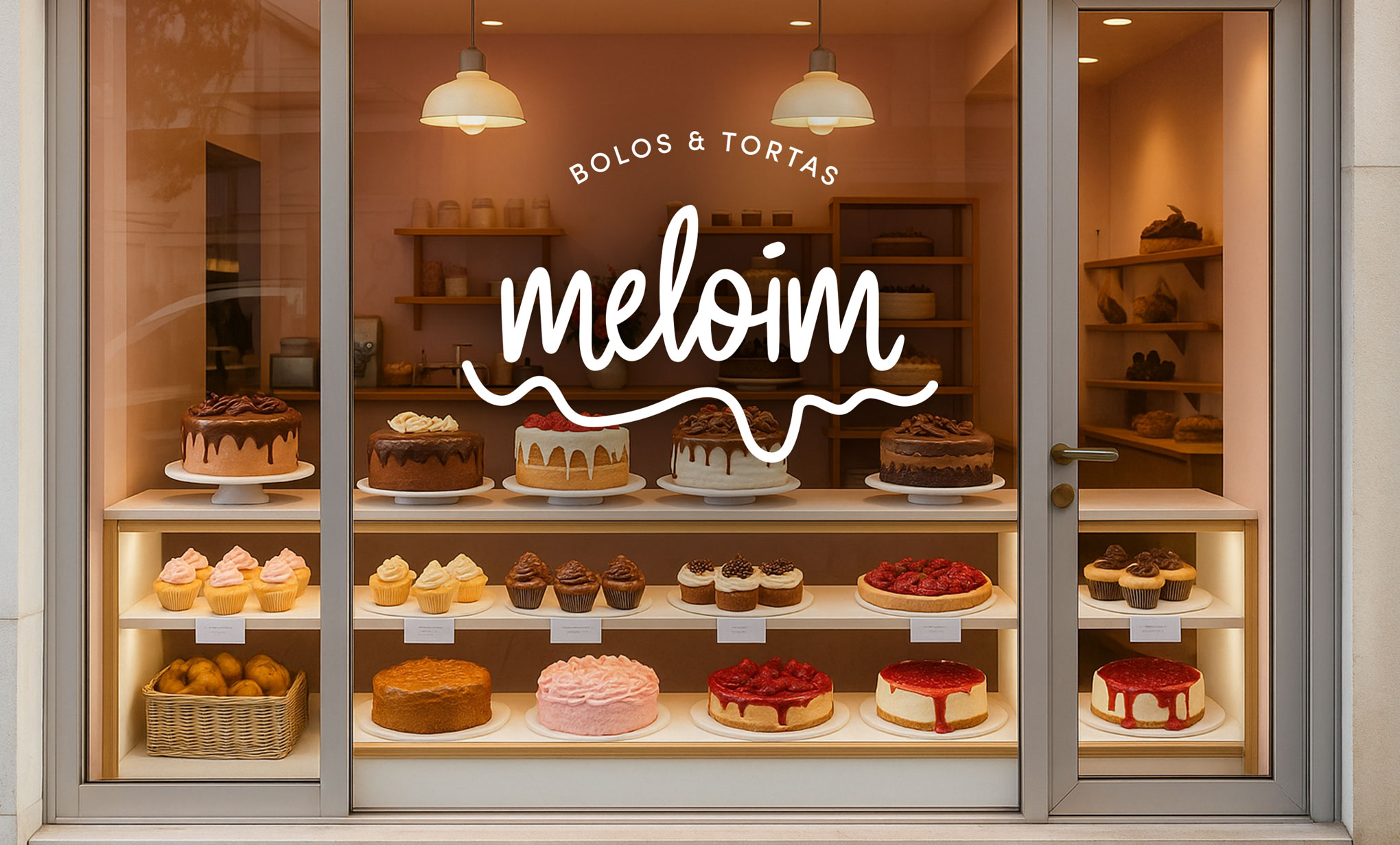
Meloim is a bakery specializing in cakes and sweets, but its real product is an emotional state. The brand's differentiation is authenticity: the comfort and nostalgia of genuinely homemade sweets, designed to remind people that indulgence is something to celebrate, not apologize for.
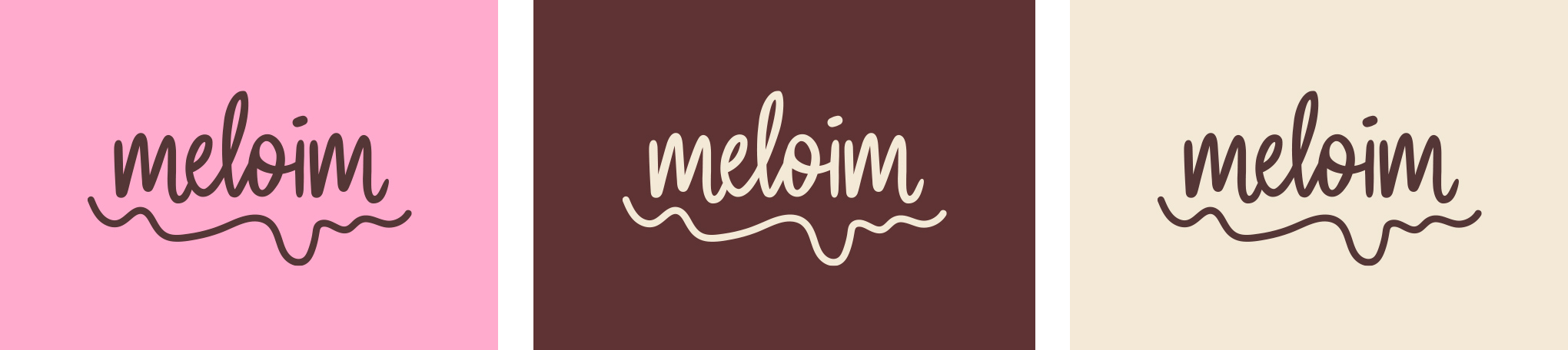
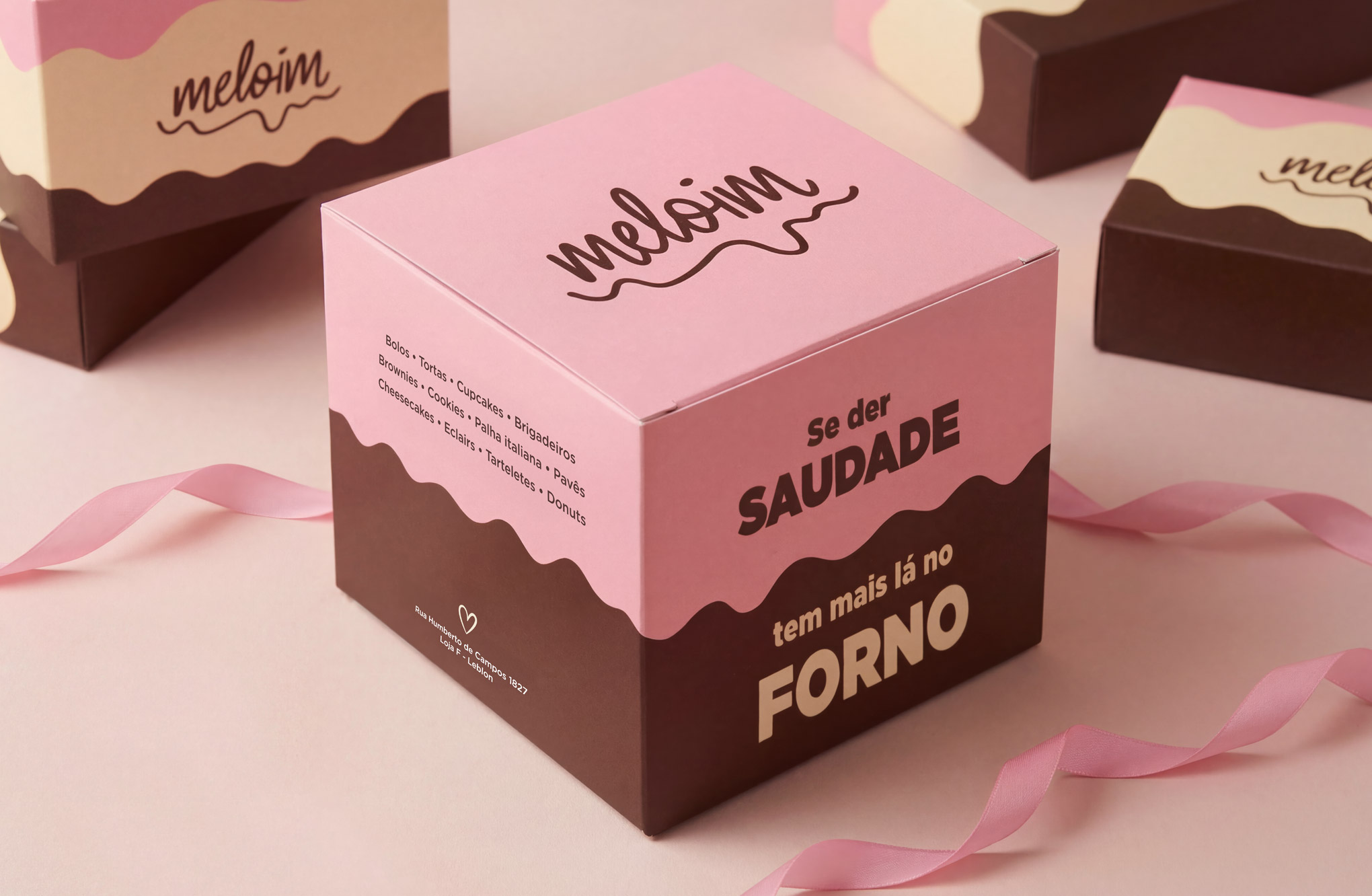
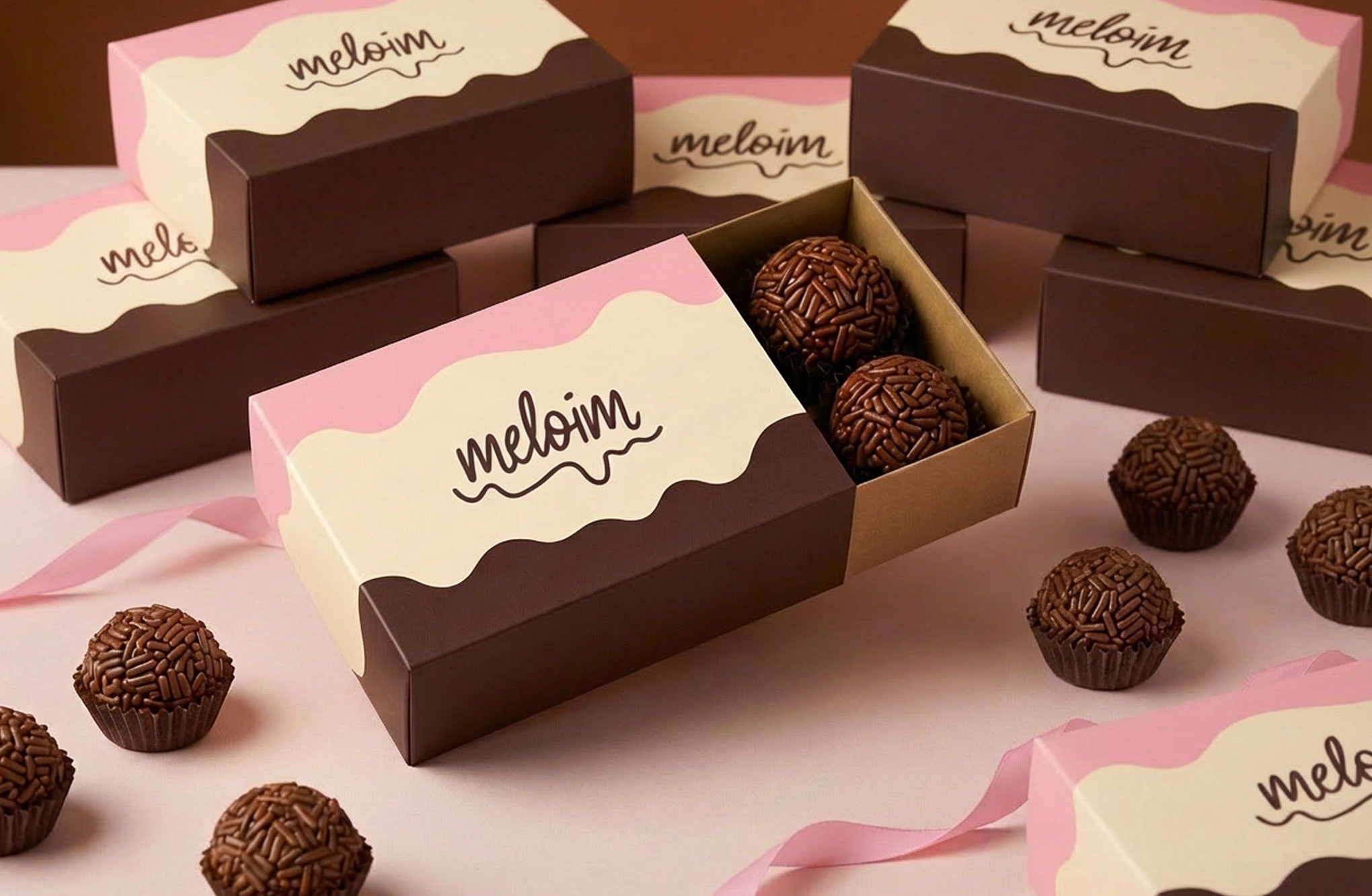
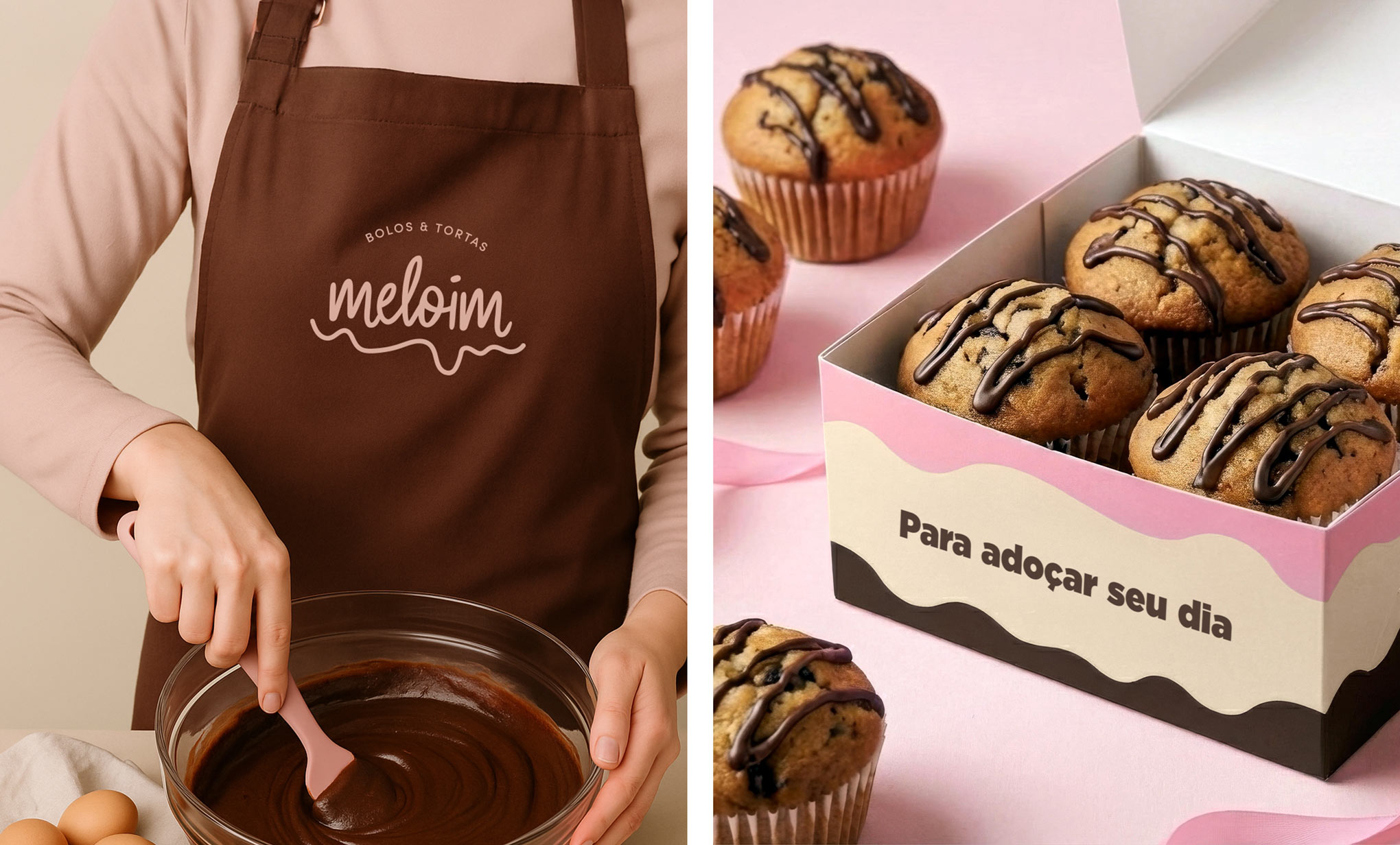
The wordmark is fully hand-drawn, fluid, slightly imperfect, and unmistakably human. The letterforms carry the ease of script written with confidence and warmth. The trailing flourish beneath the logotype was drawn to evoke dripping icing, the satisfying curve of something poured, connecting the mark directly to the sensory experience of the product.
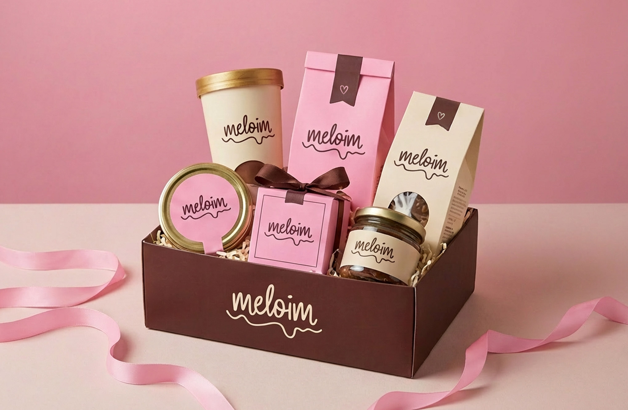
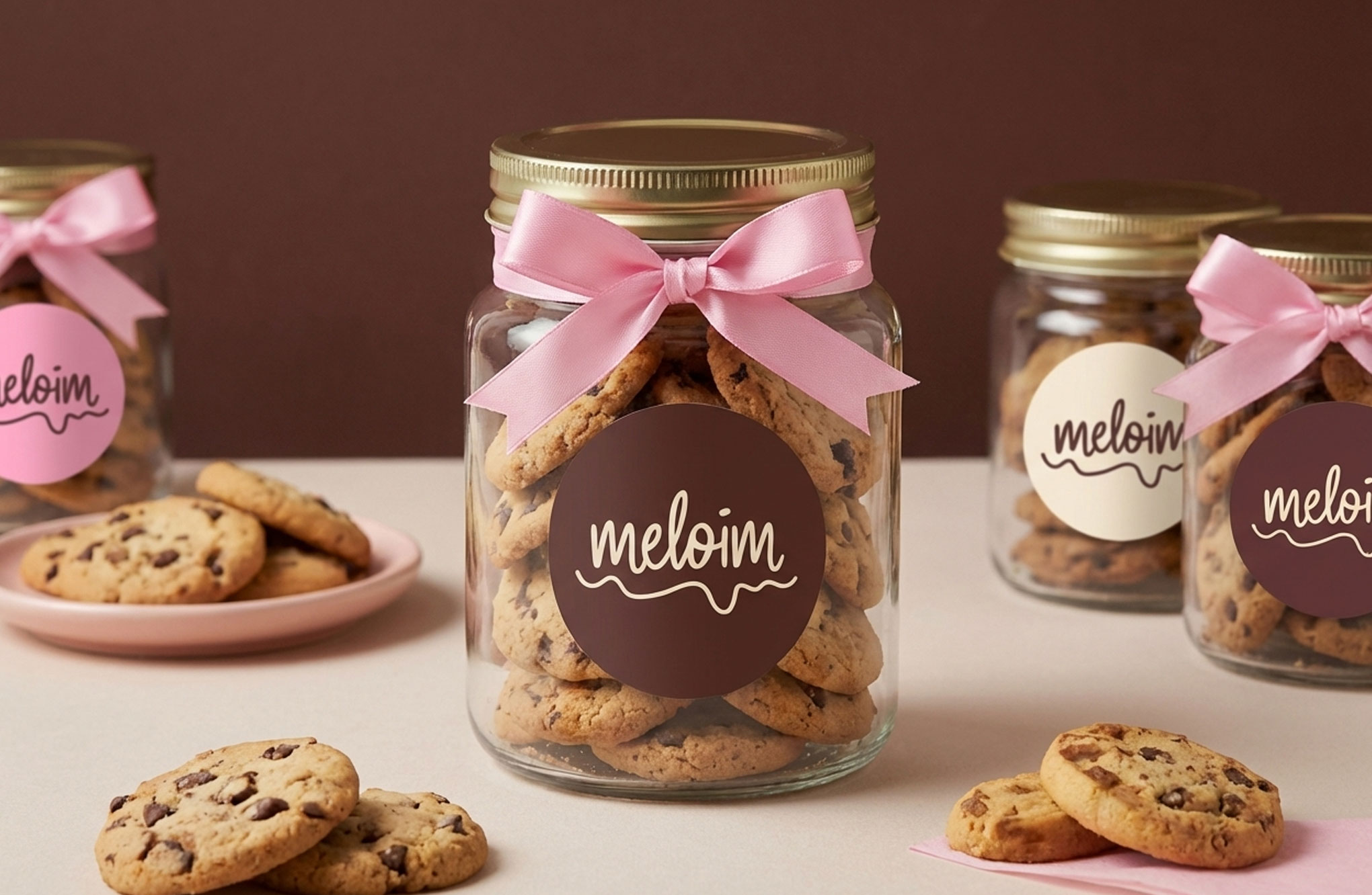
That motif extends throughout the identity as a system of wavy underlining shapes and layered patterns that suggest richness and indulgence across packaging. The color palette, dusty rose, deep chocolate brown, and warm cream, works as a set of tones that feel edible.
Every element of the identity communicates the same thing: made with care, meant to be enjoyed (without any guilt!).
INFO:
Client: Meloim Year: 2020 My Role: Logo Concept, Logo Design, Packaging