Ró is a gourmet restaurant in Rio de Janeiro offering a raw, plant-based menu, a place where natural and organic ingredients are treated as fine material, plated with the precision and artistry of haute cuisine. The brief called for a visual language that could hold the same sophistication.
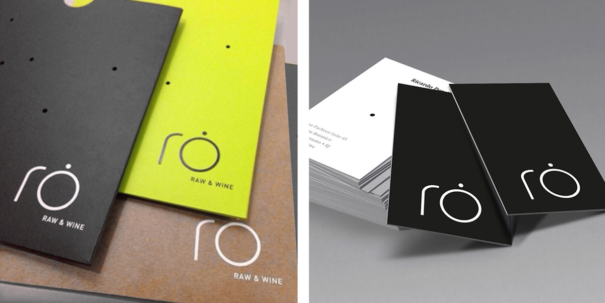
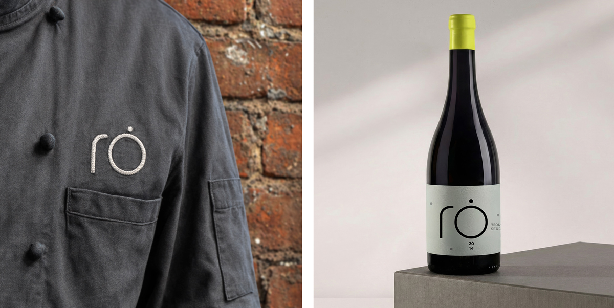
The custom letterforms are geometric and rounded, deliberately soft at every corner, because the natural world has no hard edges. The distinctive circular accent above the “o,” which doubles as the brand’s primary motif, was drawn from that same logic: a form found in nature, closed and complete.
The circular accent extends beyond the logo, appearing as a recurring visual device across menus, materials, and communication, a quiet signature that builds recognition without repetition.
Monochromatic black and white establish sophistication, while a sharp lime green operates as the brand’s essential counterpoint, organic and alive. The result is a contemporary, refined identity that mirrors Ró’s philosophy: transforming raw food into art.
INFO:
Client: Ró Company: Noar Year: 2016 My Role: Logo Concept, Logo Design, Branding, Menu, Business Card Photos: Rodrigo Azevedo